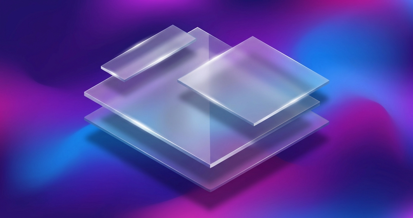
Frosted glass is everywhere in interface design right now: translucent panels, blurred backgrounds, and thin borders that give a layout some depth. Frostpane is my SCSS library for building those effects without fighting performance or browser support every time.
The Anatomy of Frosted Glass Effects
The effect comes from a handful of CSS properties stacked together:
.frost-panel {
  background: rgba(255, 255, 255, 0.15);
  backdrop-filter: blur(10px);
  -webkit-backdrop-filter: blur(10px);
  border: 1px solid rgba(255, 255, 255, 0.2);
  border-radius: 16px;
  box-shadow: 0 8px 32px rgba(0, 0, 0, 0.1);
}
Each property contributes to the effect: the semi-transparent background provides the base layer, backdrop-filter creates the blur on content behind the element, the subtle border adds definition, and the shadow creates depth.
SCSS Architecture for Flexibility
Frostpane combines CSS custom properties with SCSS mixins so the look stays adjustable:
:root {
  --frost-blur: 10px;
  --frost-saturation: 180%;
  --frost-opacity: 0.15;
  --frost-border-opacity: 0.2;
  --frost-radius: 16px;
}

@mixin frost-base($blur: var(--frost-blur)) {
  backdrop-filter: blur($blur) saturate(var(--frost-saturation));
  -webkit-backdrop-filter: blur($blur) saturate(var(--frost-saturation));
  background: rgba(255, 255, 255, var(--frost-opacity));
  border: 1px solid rgba(255, 255, 255, var(--frost-border-opacity));
  border-radius: var(--frost-radius);
}
The custom properties give you runtime theming with sensible defaults. You can override individual values in the browser without recompiling the stylesheet.
Light and Dark Mode Variants
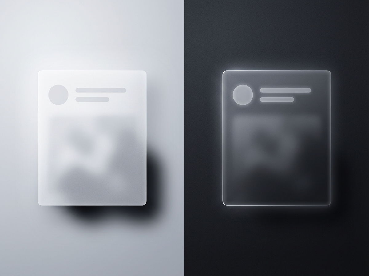
Liquid glass requires different treatments for light and dark backgrounds:
@mixin frost-light {
  @include frost-base;
  background: rgba(255, 255, 255, 0.25);
  border-color: rgba(255, 255, 255, 0.3);
}

@mixin frost-dark {
  @include frost-base;
  background: rgba(0, 0, 0, 0.25);
  border-color: rgba(255, 255, 255, 0.1);
}

@media (prefers-color-scheme: dark) {
  .frost-panel {
    @include frost-dark;
  }
}
The prefers-color-scheme query swaps variants automatically, so the panels match whichever theme the user is running.
Performance Considerations
Backdrop filters can impact rendering performance, particularly on lower-powered devices. Frostpane includes performance-conscious defaults:
@mixin frost-performant {
  @include frost-base;

  @media (prefers-reduced-motion: reduce) {
    backdrop-filter: none;
    background: rgba(255, 255, 255, 0.85);
  }

  // Fallback for unsupported browsers
  @supports not (backdrop-filter: blur(1px)) {
    background: rgba(255, 255, 255, 0.9);
  }
}
Browsers without backdrop-filter get a solid background, and anyone who has asked for reduced motion drops the blur entirely.
Animation Integration
A little animation sells the effect:
@mixin frost-animated {
  @include frost-base;
  transition:
    backdrop-filter 0.3s ease,
    background 0.3s ease,
    transform 0.3s ease;

  &:hover {
    --frost-blur: 15px;
    --frost-opacity: 0.2;
    transform: translateY(-2px);
  }
}
On hover the blur and opacity ramp up and the panel lifts a couple of pixels, all transitioned rather than snapped.
Highlight Effects
Adding highlights creates the impression of light catching the glass surface:
@mixin frost-highlight {
  @include frost-base;
  position: relative;

  &::before {
    content: '';
    position: absolute;
    top: 0;
    left: 0;
    right: 0;
    height: 1px;
    background: linear-gradient(
      90deg,
      transparent,
      rgba(255, 255, 255, 0.4),
      transparent
    );
  }
}
This subtle gradient along the top edge suggests a light source above the element, adding to the three-dimensional illusion.
Browser Compatibility
backdrop-filter has broad support now, but it’s still worth handling the browsers that lack it:
.frost-panel {
  // Solid fallback for older browsers
  background: rgba(255, 255, 255, 0.9);

  @supports (backdrop-filter: blur(1px)) {
    background: rgba(255, 255, 255, 0.15);
    backdrop-filter: blur(10px);
  }
}
The feature query means older browsers get a solid panel instead of a transparent, unreadable one.
Component Variations
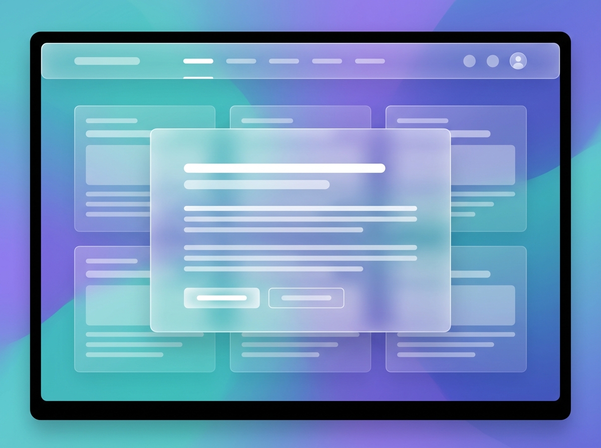
Frostpane includes pre-built component styles for common use cases:
.frost-card {
  @include frost-base;
  padding: 1.5rem;
}

.frost-nav {
  @include frost-base;
  position: fixed;
  top: 0;
  width: 100%;
  z-index: 100;
}

.frost-modal {
  @include frost-base;
  max-width: 500px;
  margin: auto;
}
Treat them as starting points and adjust from there to fit whatever you’re building.
Integration Patterns
Dropping it into an existing project is straightforward:
// Import the library
@use 'frostpane' as frost;

// Apply to custom components
.my-sidebar {
  @include frost.frost-base;
  @include frost.frost-highlight;
  width: 280px;
  padding: 1rem;
}
The namespaced @use keeps Frostpane’s mixins from colliding with anything else in your styles.
See Frostpane in action at cameronrye.github.io/frostpane or explore the source code on GitHub.
Keep Reading
Companion projectFrostpane
A customizable CSS/SCSS library for frosted glass effects with backdrop blur, highlights, and smooth animations.
View this project →Building Aranet: A Rust Toolkit for Liberating Environmental Sensor Data
How I built a seven-crate Rust workspace that reads Aranet CO2, radon, and radiation sensors over Bluetooth LE and stores the data locally, no cloud required.
Retro Floppy: Building an Interactive 3.5" Floppy Disk React Component
I recreated the 3.5-inch floppy disk as a React component (metal slider, write-protect tab and all): 1.44 MB of nostalgia for modern UIs.
Subscribe
Was this helpful?
Discuss
Ask can help explain concepts, provide context, or point you to related content.