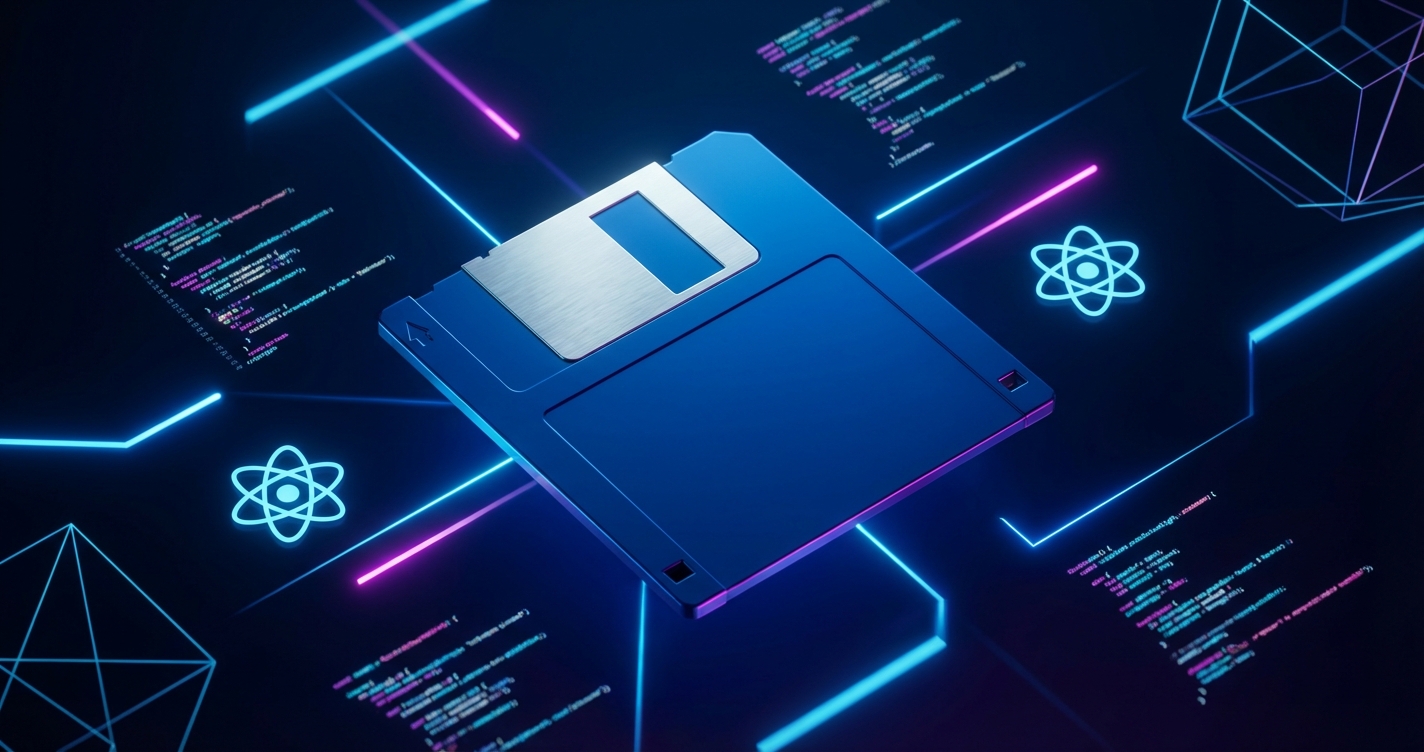
The 3.5-inch floppy disk is still one of the most recognizable icons in personal computing. It held all of 1.44 megabytes, yet those disks carried operating systems and save files people actually cared about. The Retro Floppy component rebuilds that artifact in React, interactive elements and animations included.
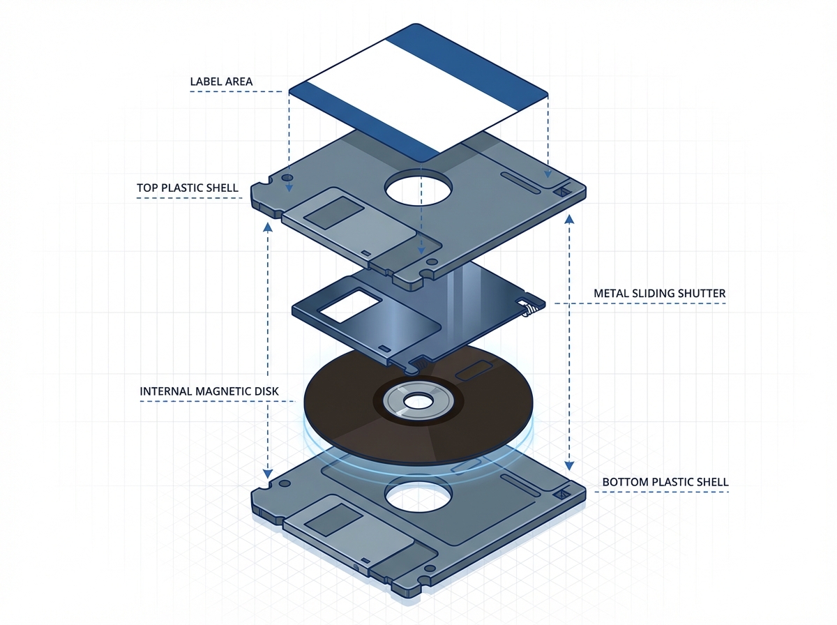
Anatomy of a Floppy Disk
Recreating the floppy disk faithfully requires attention to its distinctive features:
- The Metal Slider: The spring-loaded cover protecting the magnetic media
- The Label Area: Where users wrote cryptic file descriptions
- The Write-Protect Tab: That small sliding switch that saved many files
- The Hub Ring: The metal center that the drive motor engaged
Each one is something to animate or make interactive.
Component Architecture
The component uses composition to separate visual elements:
interface FloppyDiskProps {
  label?: string;
  color?: string;
  onClick?: () => void;
  isInserted?: boolean;
}

export function FloppyDisk({
  label = 'UNTITLED',
  color = '#1a1a2e',
  onClick,
  isInserted = false
}: FloppyDiskProps) {
  return (
    <div
      className={`floppy-disk ${isInserted ? 'inserted' : ''}`}
      style={{ '--disk-color': color } as React.CSSProperties}
      onClick={onClick}
    >
      <MetalSlider />
      <LabelArea text={label} />
      <WriteProtectTab />
      <HubRing />
    </div>
  );
}
CSS custom properties handle color theming without changing the component’s structure.
The Metal Slider Animation
The sliding metal cover is the disk’s most interactive element:
.metal-slider {
  position: absolute;
  width: 60%;
  height: 30%;
  background: linear-gradient(
    to bottom,
    #c0c0c0 0%,
    #808080 50%,
    #c0c0c0 100%
  );
  transform: translateX(0);
  transition: transform 0.3s cubic-bezier(0.4, 0, 0.2, 1);

  .floppy-disk:hover & {
    transform: translateX(30%);
  }
}
The cubic-bezier timing function mimics the spring-loaded action of a real slider.
Realistic Material Rendering
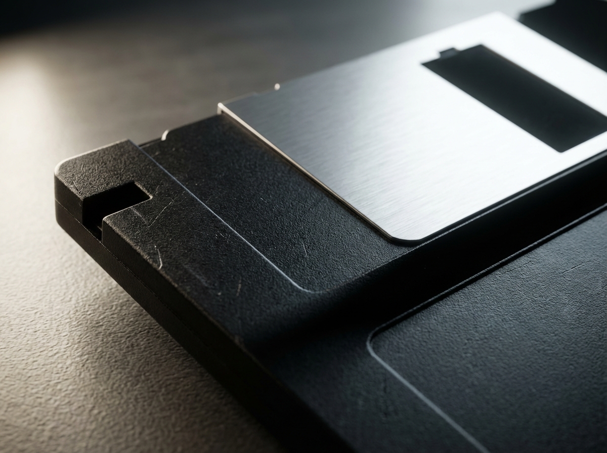
CSS gradients create the plastic texture:
.floppy-disk {
  background: linear-gradient(
    145deg,
    var(--disk-color) 0%,
    color-mix(in srgb, var(--disk-color) 80%, black) 100%
  );
  box-shadow:
    inset 2px 2px 4px rgba(255, 255, 255, 0.1),
    inset -2px -2px 4px rgba(0, 0, 0, 0.2),
    4px 4px 12px rgba(0, 0, 0, 0.3);
}
The combination of gradients and shadows creates depth that suggests the molded plastic of the original.
Label Typography
The label area deserves special attention. Many users remember handwritten labels in various states of legibility:
function LabelArea({ text }: { text: string }) {
  return (
    <div className="label-area">
      <div className="label-text">
        {text}
      </div>
      <div className="label-lines">
        {[...Array(3)].map((_, i) => (
          <div key={i} className="label-line" />
        ))}
      </div>
    </div>
  );
}
.label-area {
background: #f5f5dc;
border: 1px solid #ccc;
padding: 8px;
}
.label-text {
font-family: 'Courier New', monospace;
font-size: 12px;
text-transform: uppercase;
}
.label-lines {
margin-top: 4px;
.label-line {
height: 1px;
background: #ddd;
margin: 4px 0;
}
}The ruled lines evoke office supply aesthetics of the era.
Insertion Animation
Simulating disk insertion adds another layer of interactivity:
@keyframes insert-disk {
  0% {
    transform: translateY(0) rotateX(0);
  }
  50% {
    transform: translateY(20px) rotateX(-5deg);
  }
  100% {
    transform: translateY(80%) rotateX(0);
    opacity: 0.7;
  }
}

.floppy-disk.inserted {
  animation: insert-disk 0.5s ease-in-out forwards;
}
The slight rotation mimics the angle at which disks were typically inserted into drives.
Sound Effects Integration
Audio feedback sells the nostalgia:
function useFloppySounds() {
  const clickSound = useRef(new Audio('/sounds/disk-click.mp3'));
  const insertSound = useRef(new Audio('/sounds/disk-insert.mp3'));

  return {
    playClick: () => clickSound.current.play(),
    playInsert: () => insertSound.current.play()
  };
}
The characteristic clicking and whirring of floppy drives remains deeply embedded in the memory of anyone who used them.
Accessibility Considerations
Interactive components must remain accessible:
<div
  className="floppy-disk"
  role="button"
  tabIndex={0}
  aria-label={`Floppy disk labeled ${label}`}
  onKeyDown={(e) => {
    if (e.key === 'Enter' || e.key === ' ') {
      onClick?.();
    }
  }}
>
Keyboard navigation and screen reader support ensure the component works for all users.
Practical Applications
The component finds use in various contexts:
- Retro-themed websites: Adding period-appropriate UI elements
- Save indicators: Visual feedback for save operations
- Portfolio pieces: Showcasing creative CSS and React skills
- Educational content: Illustrating computing history
Performance Optimization
Animations should not impact performance:
.floppy-disk {
  will-change: transform;
  transform: translateZ(0);
}
These hints enable GPU acceleration for smooth animations even on less powerful devices.
See the Retro Floppy component in action at cameronrye.github.io/retro-floppy or explore the source code on GitHub.
Keep Reading
Companion projectRetro Floppy
An interactive 3.5" floppy disk React component for retro-themed UIs
View this project →Building Zero Crust: Distributed State Management in Electron
Two displays, one source of truth: how I built a dual-head POS simulator in Electron with centralized state, broadcast sync, and locked-down IPC.
Uzumaki: One Spiral Engine, Two Native Platforms
Ten spiral algorithms, six deployment targets: how I kept React and SwiftUI renders of Uzumaki mathematically identical across web and Apple platforms.
Building Ask: A RAG-Powered Chatbot for My Portfolio
How I built Ask, the RAG chatbot on every page of this site: Cloudflare Workers AI, Vectorize, and the prompt-injection hardening it took to ship.
Subscribe
Was this helpful?
Discuss
Ask can help explain concepts, provide context, or point you to related content.