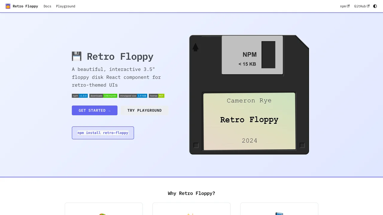
A 3.5” floppy disk held just 1.44 megabytes, yet it remains one of the most recognizable artifacts in computing. Retro Floppy recreates it as a React component, down to the details people actually remember: the spring-loaded metal shutter, the write-protect tab, the hub ring, and the hand-labeled sticker with its ruled lines.
What was hard
Getting the disk to feel physical came down to a handful of CSS decisions. The metal shutter slides open on hover with a cubic-bezier timing curve tuned to mimic the spring-loaded action of the real mechanism, rather than a stock easing that would read as a generic UI transition. Depth comes from layered gradients and paired inset shadows that suggest molded plastic rather than a flat illustration. And because the disk is interactive, it had to work beyond the mouse: the component exposes a button role, keyboard activation, and ARIA labels so the novelty never costs accessibility.
Theme Customization
Choose from built-in themes or create your own:
import { FloppyDisk, NEON_THEME, RETRO_THEME } from 'retro-floppy';

// Use a built-in theme
<FloppyDisk theme={NEON_THEME} />

// Or create a custom theme
<FloppyDisk theme={{
  diskColor: '#1a1a2e',
  slideColor: '#c0c0c0',
  labelColor: '#ffffff',
  labelBg: '#2d2d44',
}} />
Event Handling
The component supports click and hover events:
<FloppyDisk
  onClick={() => console.log('Disk clicked')}
  onDoubleClick={() => console.log('Disk opened')}
  onHover={(isHovering) => console.log('Hover:', isHovering)}
/>
Key Features
- Interactive Design: Realistic floppy disk with sliding metal shutter animation on hover
- Built-in Themes: Light, Dark, Neon, Retro, and Pastel themes included
- TypeScript Support: Full type definitions with generics for type-safe props
- Customizable: CSS custom properties and theme objects for complete control
- Accessible: ARIA labels and keyboard navigation support
- Multiple Sizes: Tiny, small, medium, and large size variants
Quick Start
npm install retro-floppyimport { FloppyDisk } from 'retro-floppy';
import 'retro-floppy/dist/retro-floppy.css';
function App() {
return (
<FloppyDisk
label={{ name: 'My App', author: 'v1.0' }}
size="medium"
/>
);
}Was this helpful?
Want to learn more?
Ask can answer questions about this project's implementation, technologies, and more.