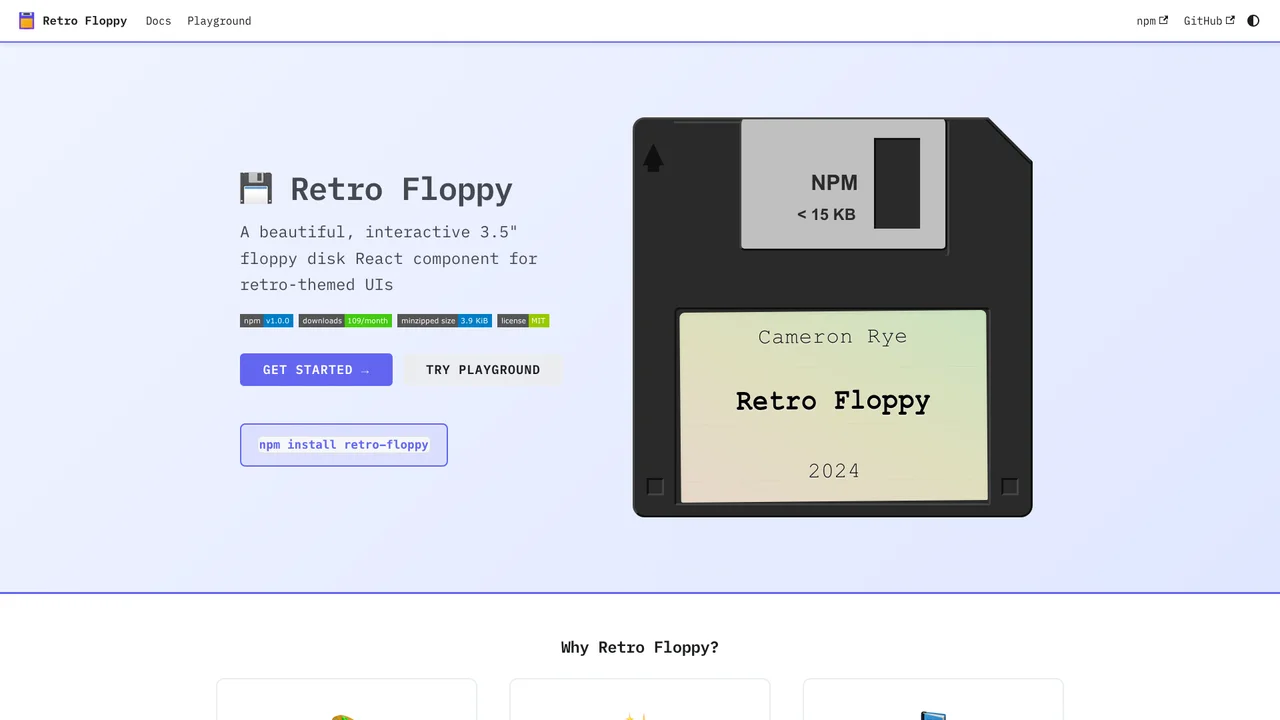
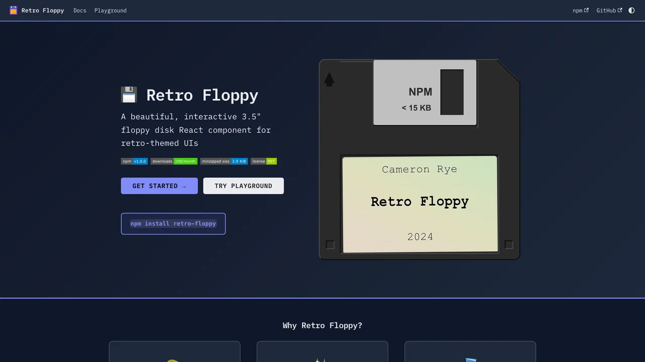
Retro Floppy is a beautiful, interactive 3.5” floppy disk React component designed for retro-themed user interfaces. It brings the nostalgia of physical computing artifacts to modern web applications with an authentic metal slider animation.
Quick Start
Install the package and import the component:
npm install retro-floppyimport { FloppyDisk } from 'retro-floppy';
import 'retro-floppy/dist/retro-floppy.css';
function App() {
return (
<FloppyDisk
label={{ name: 'My App', author: 'v1.0' }}
size="medium"
/>
);
}Theme Customization
Choose from built-in themes or create your own:
import { FloppyDisk, NEON_THEME, RETRO_THEME } from 'retro-floppy';

// Use a built-in theme
<FloppyDisk theme={NEON_THEME} />

// Or create a custom theme
<FloppyDisk theme={{
  diskColor: '#1a1a2e',
  slideColor: '#c0c0c0',
  labelColor: '#ffffff',
  labelBg: '#2d2d44',
}} />
Event Handling
The component supports click and hover events:
<FloppyDisk
  onClick={() => console.log('Disk clicked')}
  onDoubleClick={() => console.log('Disk opened')}
  onHover={(isHovering) => console.log('Hover:', isHovering)}
/>
Key Features
- Interactive Design: Realistic floppy disk with sliding metal shutter animation on hover
- Built-in Themes: Light, Dark, Neon, Retro, and Pastel themes included
- TypeScript Support: Full type definitions with generics for type-safe props
- Customizable: CSS custom properties and theme objects for complete control
- Accessible: ARIA labels and keyboard navigation support
- Multiple Sizes: Tiny, small, medium, and large size variants
Was this helpful?
Want to learn more?
Ask can answer questions about this project's implementation, technologies, and more.