This post demonstrates the comprehensive image integration system implemented for this Zola-based blog, showcasing advanced features like responsive image delivery and performance optimization.
Hero Image Example
Let’s start with a hero image that demonstrates the overlay and caption functionality:
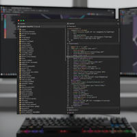
{{ hero_image(src=“/images/blog/2025/01/2025-01-26-hero-example.jpg”, alt=“Modern web development workspace with multiple monitors showing code”, caption=“Building Modern Web Applications”, overlay=“true”, overlay_opacity=“0.3”, attribution=“Photo by John Doe on Unsplash”,
attribution_url="https://unsplash.com/photo-example") }}
The hero image above automatically generates multiple sizes:
- Desktop: 1920x1080
- Tablet: 1024x576
- Mobile: 768x432
Featured Image Integration
Featured images are automatically integrated into the page metadata for social media sharing. The featured image for this post is defined in the frontmatter and will appear when shared on social platforms.
Responsive Image Examples
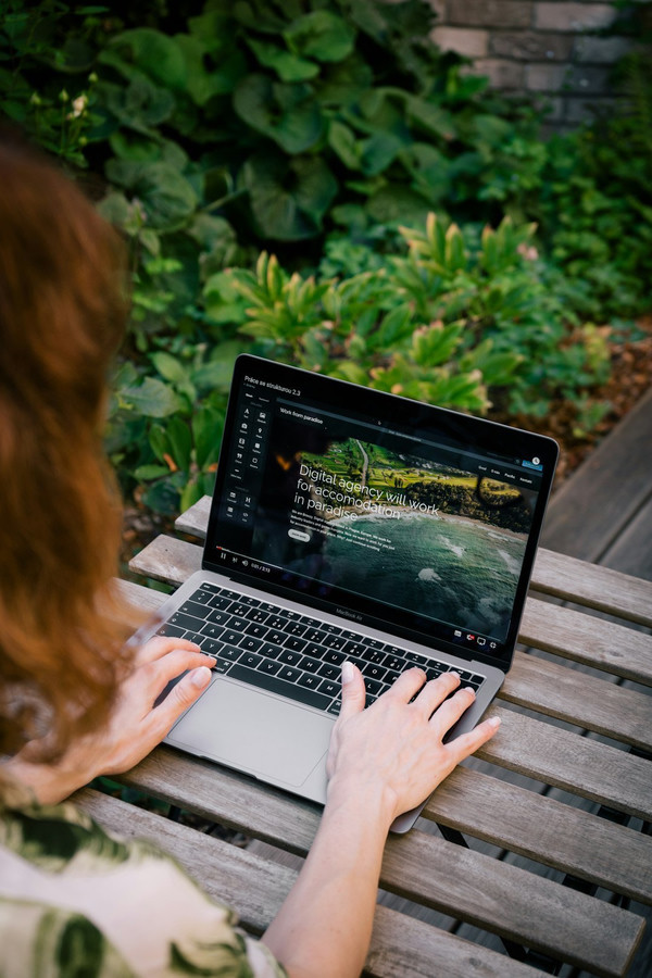
Standard Responsive Image
Here’s a responsive image that adapts to different screen sizes:
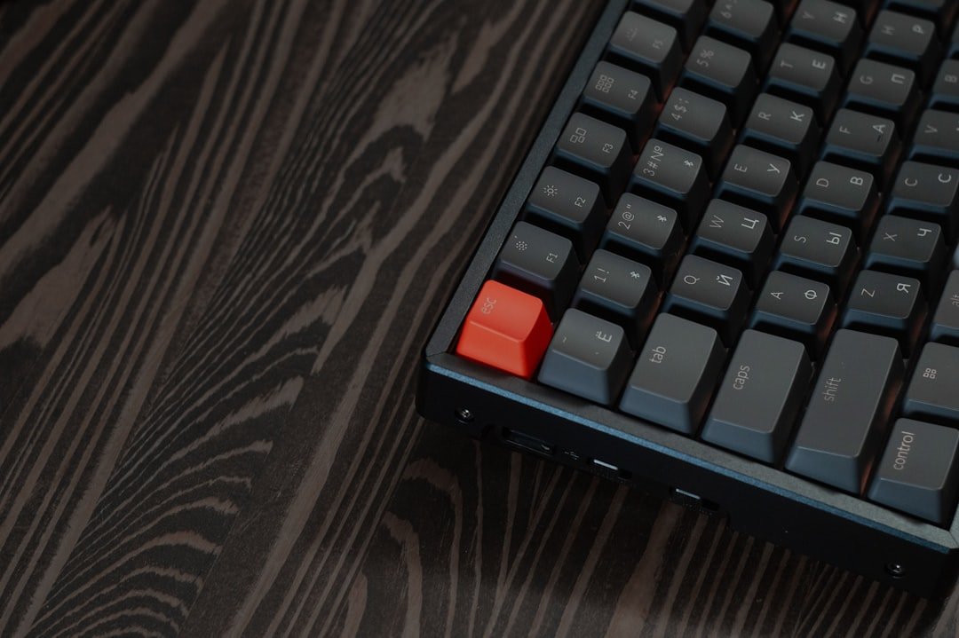
Floating Images
Images can be positioned to float alongside text content:
This floating image demonstrates how content can wrap around images for better text flow. The image automatically adjusts its size based on the viewport while maintaining optimal quality.
Lorem ipsum dolor sit amet, consectetur adipiscing elit. Sed do eiusmod tempor incididunt ut labore et dolore magna aliqua. Ut enim ad minim veniam, quis nostrud exercitation ullamco laboris nisi ut aliquip ex ea commodo consequat.
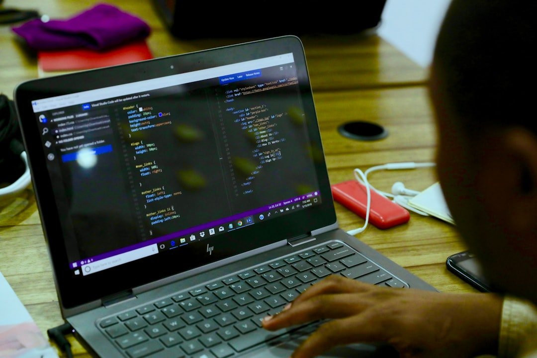
Project Screenshots
The project screenshot shortcode is perfect for showcasing development work: A comprehensive Model Context Protocol server that enables LLMs to explore and interact with the Fediverse through standardized ActivityPub integration. A modern Model Context Protocol server for Gopher and Gemini protocols, enabling AI assistants to browse these classic internet protocols safely and efficiently.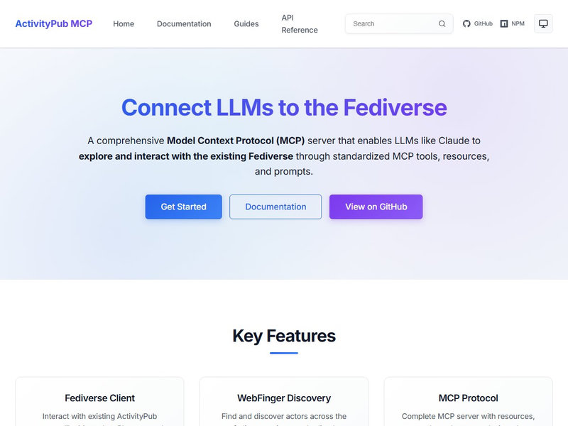
ActivityPub MCP Server
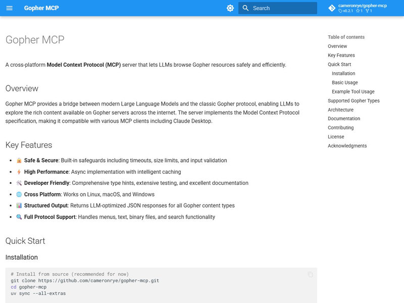
Gopher MCP Server
Image Gallery with Lightbox
The enhanced gallery shortcode provides automatic optimization and lightbox functionality:

Click on any image above to open the lightbox viewer with keyboard navigation support (arrow keys to navigate, escape to close).
Thumbnail Examples
Thumbnails are perfect for creating compact image grids: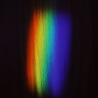

Performance Features
Automatic Optimization
All images are automatically optimized through Zola’s resize_image() function:
- Multiple Sizes: Responsive images include multiple resolutions
- Lazy Loading: Images load only when needed for better performance
- Caching: Processed images are cached for faster subsequent builds
SEO and Accessibility
- Structured Data: Proper schema markup for search engines
- Alt Text: Comprehensive alt text for screen readers
- Social Media: Open Graph images for social sharing
- Performance: Optimized loading for Core Web Vitals
Technical Implementation
Shortcode Usage
<!-- Basic responsive image -->
{{ "{{ responsive_image(src=\"/images/example.jpg\", alt=\"Description\") }}" }}

<!-- Gallery with lightbox -->
{{ "{{ gallery(images=\"img1.jpg,img2.jpg\", captions=\"Cap1,Cap2\", columns=\"3\") }}" }}

<!-- Project showcase -->
{{ "{{ project_screenshot(src=\"/images/project.jpg\", title=\"Project Name\", github_url=\"https://github.com/user/repo\") }}" }}
File Organization
static/images/
├── blog/2025/01/          # Blog post images
├── projects/              # Project screenshots
├── site/                  # Site assets
└── sources/               # High-resolution originals
Conclusion
This comprehensive image integration system provides:
- Performance: Lazy loading and responsive delivery
- User Experience: Lightbox galleries, smooth transitions, keyboard navigation
- Developer Experience: Simple shortcodes, automatic optimization, consistent sizing
- SEO: Proper metadata, structured data, social media integration
- Accessibility: Alt text, keyboard navigation, screen reader support
The system leverages Zola’s powerful image processing capabilities while providing a clean, user-friendly interface for content creators. All images are automatically optimized for web delivery while maintaining high quality across different devices and screen sizes.
This showcase demonstrates the power of combining Zola’s built-in image processing with custom shortcodes and responsive design principles.